
HOKU is the night of the fullest moon in the Native Hawaiian culture. It illuminates the dark night with its grace and beauty. HOKU Magazine is an online sustainable fashion magazine that highlights the beauty and integrity of the fashion industryHOKU is the night of the fullest moon in the Native Hawaiian culture. It illuminates the dark night with its grace and beauty. HOKU Magazine is an online sustainable fashion magazine that highlights the beauty and integrity of the fashion industry
How We Helped This Brand Shine
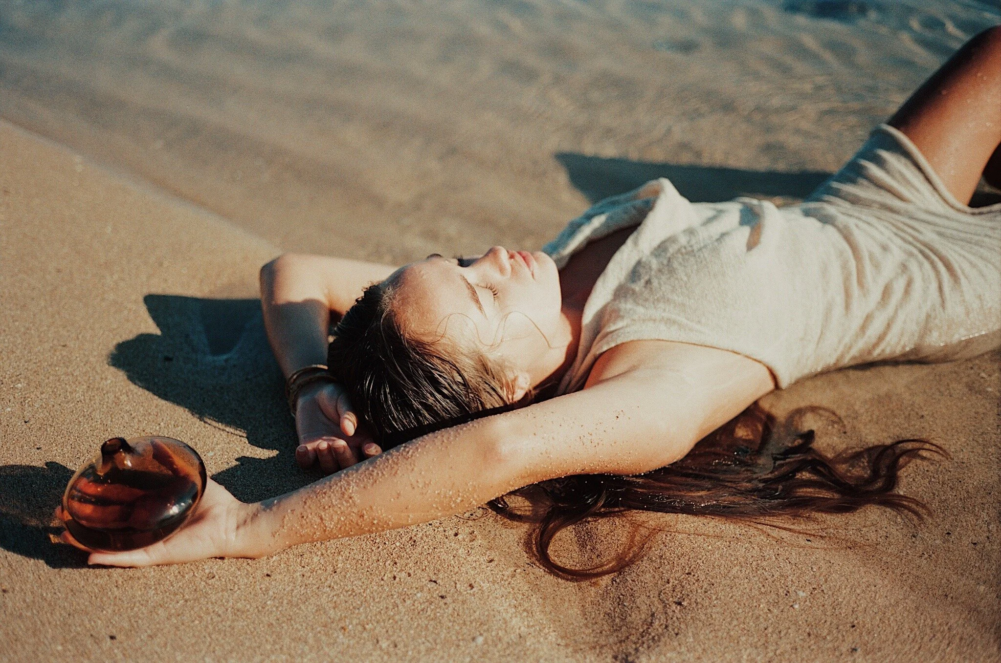
The brand identity of this unique brand revolves around the powerful interplay of black and white hues, enriched by vibrant imagery and photography. The black and white foundation symbolizes a timeless elegance and versatility, while the infusion of modern imagery infuses the brand with energy and a touch of exotic allure. Beyond aesthetics, sustainability is at the heart of this brand, and our design choices reflect this commitment. The carefully curated visual elements not only captivate attention but also convey the brand's dedication to eco-conscious practices, creating a cohesive and impactful brand identity that speaks to both style and sustainability.
-
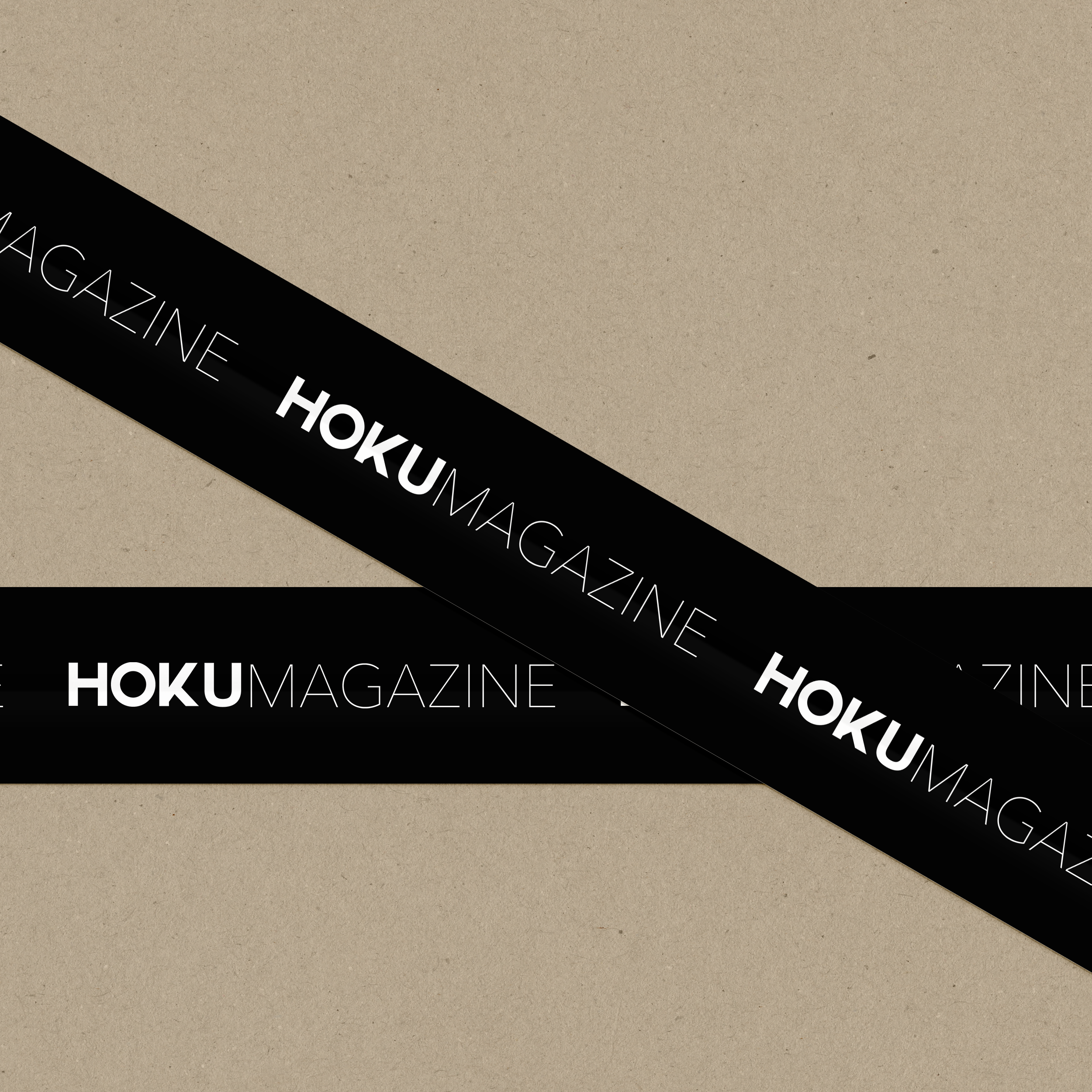
For HOKU MAGAZINE, we employed a bold and modern font to define its brand identity. The chosen font exudes confidence and contemporary flair, reflecting the dynamic nature of the magazine. Its bold strokes and sleek design capture attention, making a strong visual statement that aligns seamlessly with the brand's ethos.
-
The combination of modernity and timelessness was a strategic choice aimed at creating a brand identity that not only captures the essence of contemporary design but also withstands the test of time, establishing SAINT INTERIORS as a symbol of enduring style and innovation in the interior design landscape.